
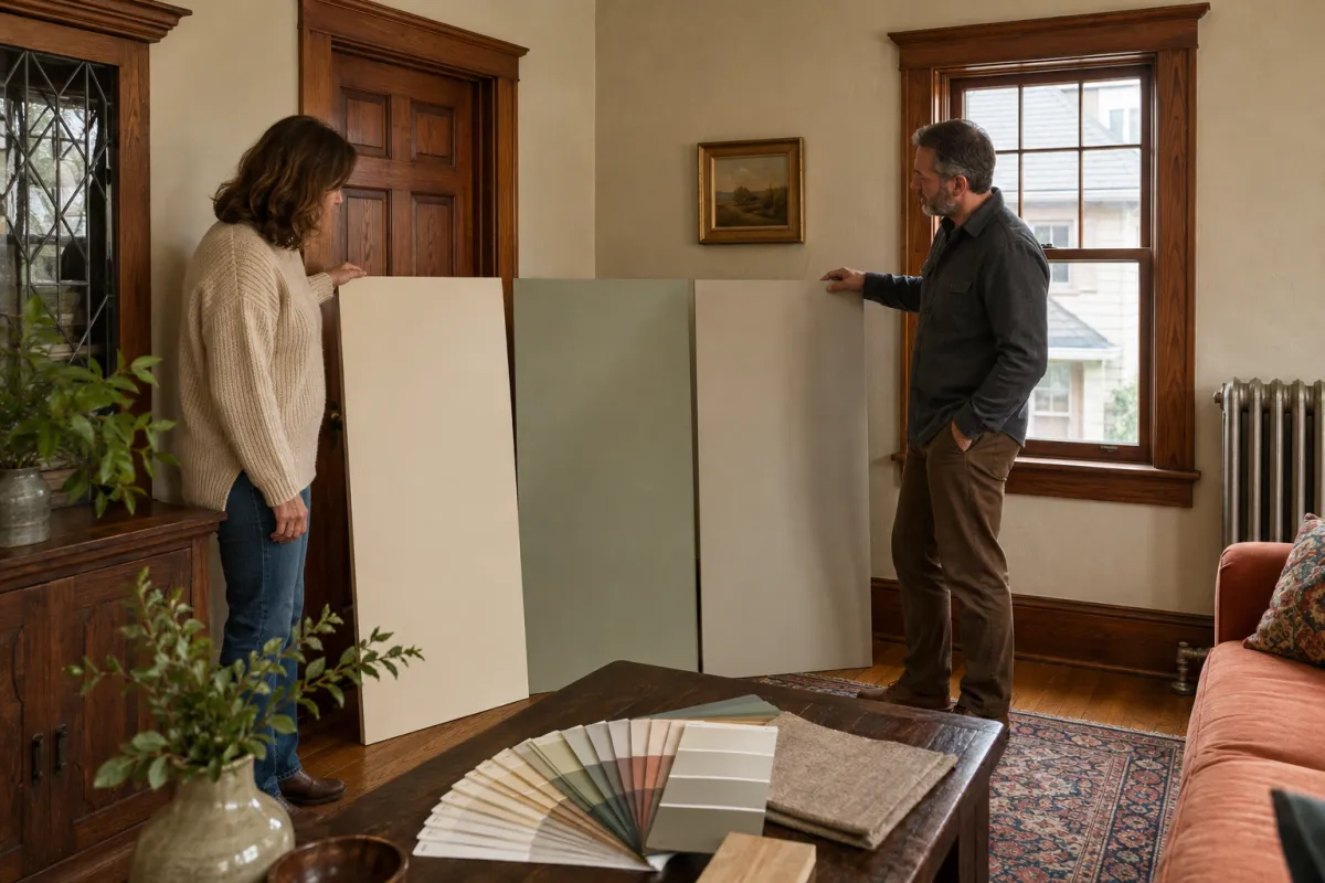
How to Choose Interior Paint Colors for Older Homes
Choosing a color for a new-construction room is fairly forgiving. Choosing one for a home built decades ago is a different exercise, because the walls are not the only thing in the conversation. Original woodwork, plaster texture, smaller windows and older light fixtures all push the result in one direction or another.
The most useful principle in how to choose interior paint colors is this: start with what you are not changing. Everything you cannot or will not replace sets the boundaries, and the paint has to live inside them.
Here is a practical method that works well in the older homes common across Old Forge, Scranton and the surrounding boroughs.
STEP 1: INVENTORY THE FIXED ELEMENTS
Walk each room and list what is staying:
- Wood trim, doors, staircases and built-ins, and whether they are stained or painted
- Flooring, whether original hardwood, tile or carpet
- Fireplace surrounds, brick and stone
- Countertops, backsplashes and tile in kitchens and baths
- Large furniture that is not being replaced
- Existing light fixtures and the color of light they produce
These items already have undertones. Your paint color either agrees with them or fights them, and paint is the cheapest thing in that list to change.
STEP 2: LEARN TO SEE UNDERTONES
Undertone is the subtle color hiding beneath a neutral. Two beiges can look identical on a chip and completely different on a wall, because one leans pink and the other leans green.
A simple way to spot them is to place several candidate samples side by side on white paper. Against each other, the underlying bias becomes obvious in a way it never is in isolation.
Common Undertone Situations in Older Homes
- Warm stained oak or chestnut trim tends to pull orange or red. Cool gray walls often clash with it, while warmer neutrals, soft greens and muted golds usually sit better.
- Original red brick or a brick fireplace carries strong warmth that will influence everything around it.
- Older ceramic tile in bathrooms often has a distinctive period undertone such as pink, mint or pale yellow, which needs to be worked with rather than ignored.
- Refinished hardwood floors shift warm after finishing, sometimes more than expected.
STEP 3: ACCOUNT FOR THE LIGHT YOU ACTUALLY HAVE
Light direction changes color more than most people believe.
- North-facing rooms receive cool, indirect light all day. Colors read cooler and grayer here, and cool grays can turn flat or bluish, so warmer selections generally hold up better.
- South-facing rooms get warm, generous light that makes most colors read brighter and warmer.
- East-facing rooms are warm in the morning and cooler by afternoon.
- West-facing rooms are the reverse, muted early and warm and intense in the evening.
Older homes often have fewer or smaller windows than modern construction, plus deeper window wells in plaster walls. That means less light reaching the middle of the room, so a color that looked light on the chip can read several shades deeper on the wall.
Also consider your bulbs. Warm-toned bulbs push colors amber, while cooler bulbs flatten warm tones. Since you probably use a room most in the evening, judge it under the lighting you actually live with.
STEP 4: TEST PROPERLY - THIS IS THE STEP PEOPLE SKIP
Small chips held against a wall are nearly useless. They are too small, they are surrounded by the existing color, and they are usually viewed in the wrong light.
Do this instead:
1. Get sample pots of three to four candidates, not ten.
2. Paint large boards, such as poster board or primed hardboard at roughly two feet square, with two coats.
3. Use boards rather than painting directly on the wall, so you can move each one around the room.
4. Look at them against the trim, next to the flooring, and beside the furniture that is staying.
5. View them in morning light, afternoon light and under evening lamps.
6. Live with them for at least two or three days before deciding.
Test in the sheen you intend to use, since the same color reads differently in flat versus satin. Our guide to picking the right sheen for each room explains how much difference that makes.
STEP 5: BUILD A PALETTE THAT FLOWS
In an older home with open sightlines between rooms, colors are rarely seen in isolation. A workable approach:
- Choose one main wall color for the connected living spaces such as the hallway, living room and dining room.
- Add one or two related colors for rooms that are more separate, such as bedrooms, a study or a powder room.
- Pick one trim color and carry it through the entire house for consistency.
- Keep ceilings consistent, usually a flat white or a very slightly tinted version of the wall color.
- Save bolder color for enclosed rooms, such as a powder room, a small office or a single accent wall in a defined space.
Consistent trim is the trick that makes a varied palette feel deliberate rather than scattered.
STEP 6: DECIDE WHAT TO DO ABOUT ORIGINAL WOODWORK
This is the defining decision in many older homes, and it deserves real thought.
Keeping stained woodwork preserves period character and is often the right call when the wood is in good condition and consistent throughout. Wall colors then need to work with its warmth.
Painting the trim brightens rooms dramatically and gives far more freedom with wall colors. It is generally not reversible in any practical sense, so it is worth being certain before an interior painting project begins.
A middle path exists. Keep the stained woodwork in the primary rooms where it is a feature, and paint the trim in secondary spaces such as bedrooms, upper hallways or a converted attic.
COMMON MISTAKES TO AVOID
- Choosing a color under paint-store lighting, which is nothing like your home
- Matching to a photo online, since screen calibration and staged lighting are not reality
- Selecting a color that ignores fixed warm elements like brick or oak
- Using too many unrelated colors across connected spaces
- Testing on only one wall in one light condition
- Forgetting that ceilings and trim are colors too, not defaults
BRINGING IT TOGETHER
Knowing how to choose interior paint colors comes down to a sequence rather than inspiration. Identify what stays, read the undertones, respect the light in each room, test large samples over several days, and build a palette that carries a consistent trim color through the house.
In an older home that process matters more, because the architecture is already making strong statements. The most successful color choices support what is already there rather than competing with it.
"In an older home, the paint color is not the star of the room. It is the thing that makes everything else in the room look intentional."
Advanced Painting Professionals works in older Northeast Pennsylvania homes regularly and can talk through how your samples will behave on plaster, beside stained woodwork, and in the light your rooms actually get. Call (570) 290-8471 or book an in-home consultation at https://advancedpaintingprofessionals.com. Serving Old Forge, Scranton and the surrounding counties.
FREQUENTLY ASKED QUESTIONS (FAQs)
Q: How many colors should a whole-home palette include?
A: Most homes look cohesive with one main color for connected spaces, one or two secondary colors for private rooms, one consistent trim color and one ceiling color. More than that tends to feel disconnected.
Q: Should trim be white in a home with original stained woodwork?
A: Only if the woodwork is already painted or you have decided to paint it. Introducing bright white trim alongside warm stained wood usually emphasizes the contrast in a way that feels unresolved.
Q: Do dark colors make a small room feel smaller?
A: Not necessarily. Dark colors soften the visible edges of a room and can make a small, enclosed space feel intentional and enveloping. What genuinely shrinks a room is high contrast between walls, trim and ceiling.
Q: Can the same color be used throughout the house in different sheens?
A: Yes, and it is a clean approach. Using one color in flat on ceilings, eggshell on walls and semi-gloss on trim creates subtle definition without introducing a second color.
